A more accessible MAP Handbook

iilo designed a refreshed, more accessible MAP (Mentor-Apprentice Program) Handbook that invites deeper engagement—supporting First Nations language learners and speakers across BC and beyond to return to the resource again and again.

Communication design challenge
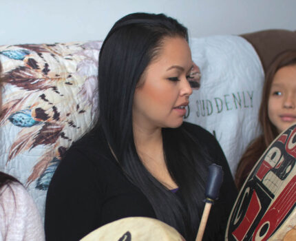
The First Peoples’ Cultural Council (FPCC) approached us to redesign one of their most widely used resources: the MAP Handbook. The Mentor-Apprentice Program (MAP) is a one-on-one language immersion program for people to become fluent speakers by bringing their language into their daily lives in the home and on the land and waters.
This handbook plays a critical role in supporting language revitalization. It’s used across communities, both in print and online, by a diverse audience—from adult learners to fluent speakers and Elders. Many readers are navigating complex emotional relationships with their languages, alongside accessibility needs such as low literacy or visual impairments.
The challenge was layered. FPCC needed a refreshed layout and design that aligned with their evolving brand, while making the content more accessible, engaging, and approachable. At the same time, the handbook needed to feel welcoming and human and still hold the clarity and credibility expected of a widely used educational resource.
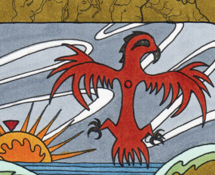
Created in parallel were custom illustrations by Elena Sterritt (Gisghaast), which we were very excited to incorporate into the new design.

Outcomes
We focused on creating a reader experience that felt inviting, grounded, and easy to move through, while supporting a wide range of reading needs.
We simplified the handbook layout to reduce cognitive load and make content easy to follow, especially for readers who may not regularly engage with written materials. A clearer visual hierarchy, thoughtful spacing, and considered typography helped guide readers through the content at a comfortable pace.
To support a more engaging and relatable experience, we introduced a warmer, more vibrant design system that softened FPCC’s corporate visual language without losing alignment with their brand. Incorporating Elena’s custom illustrations into the handbook added visual storytelling and moments of connection throughout the resource.
We also ensured the design worked seamlessly across formats. Whether printed or accessed online, the handbook maintained clarity, readability, and consistency for readers.

Our impact
iilo helped us refresh one of our most popular resources in a modernized, more accessible and more relatable design so that it can have greater uptake and result in improved outcomes.